


COMPANY
SURGE DEVELOPMENT
Surge Development originated as an innovative idea among a group of real estate professionals who identified a need for a fresh and dynamic approach within the industry. Recognizing the potential impact of their concept, they sought our expertise to transform their vision into a compelling and tangible brand. Their goal was to establish a distinct identity that would resonate with their target audience and set them apart in the competitive real estate market. With this in mind, they entrusted us to bring Surge Development to life, creating a brand that would encapsulate their innovative spirit and professional ethos.
SERVICES PROVIDED:
Brand Development, Website Design
ROI: Enhanced brand awareness

Visual Identity
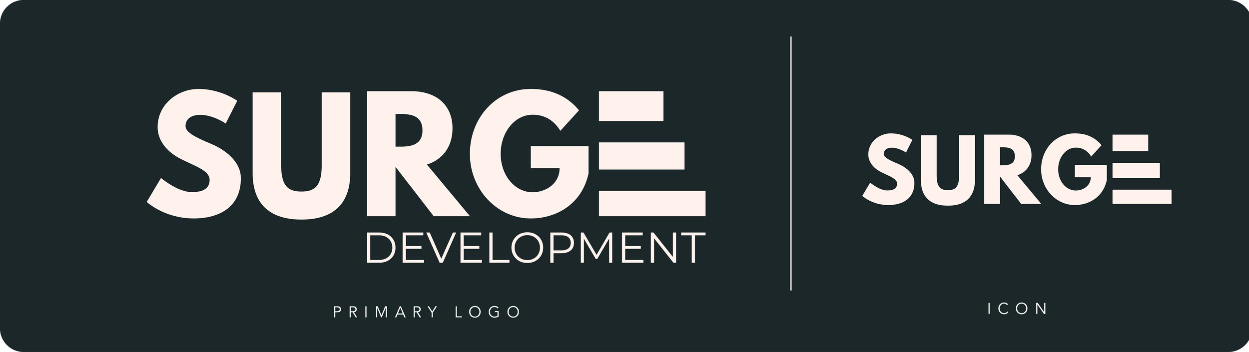
We conducted in-depth consultations with Surge Development to thoroughly understand their vision and values. Based on these insights, we designed a logo that encapsulated the dynamic and innovative spirit of their brand, ensuring it resonated with their target audience and effectively communicated their unique approach within the real estate industry.
Style Guide
We developed a comprehensive style guide to ensure brand consistency across all platforms for Surge Development. This guide included detailed guidelines for logo usage, color palettes, typography, and other visual elements, providing a cohesive framework that helped maintain a unified and professional brand image in all marketing materials and communications.


Interactive Landing Page:
We built a user-friendly and visually appealing landing page for Surge Development, ensuring it effectively conveyed the brand’s message. To enhance visitor engagement, we integrated interactive features that provided an immersive experience, capturing the dynamic essence of the brand and making the information easily accessible and engaging for users.
Completed Website Coming Soon